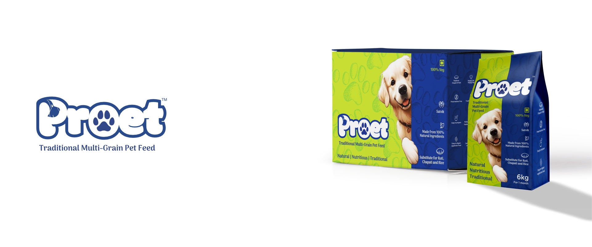
PROET - Traditional Multigrain pet feed
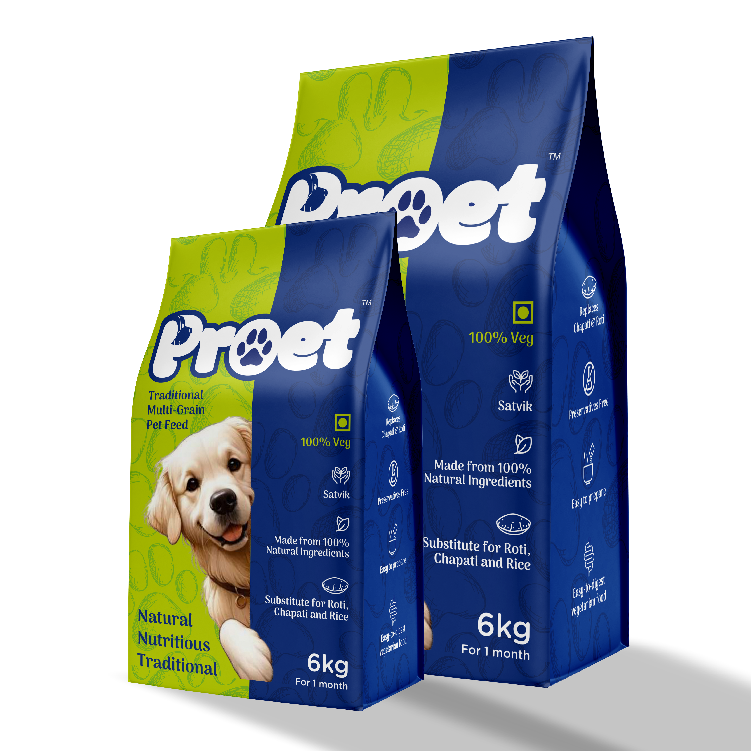
The PROET logo and packaging are thoughtfully designed to instantly convey trust, nourishment, and tradition. The bold yet friendly logotype ensures strong visibility while maintaining an approachable tone, making the brand easy to recognize and reassuring for pet parents. The color palette combines deep blue with fresh green to symbolize purity, health, and natural goodness. These colors reinforce the idea of a safe, wholesome, and balanced diet, aligning with PROET’s promise of a traditional multigrain pet feed made from natural ingredients. Clean, minimal iconography is used to communicate key product benefits such as 100% veg, satvik values, and nutritional richness. This structured visual hierarchy allows important information to be understood at a glance, enhancing clarity and consumer confidence.
Scope : Brochure Design, Visual Identity & Print Production
Client : PROET - Traditional Multigrain pet feed, Maharashtra .
Next Project
Demo work Name
exhibition design